Timestamp
Timestamp came to us building a Bitcoin investment platform for serious founders and serious capital. The brand needed to signal credibility in a category where most players still look like they're cosplaying as fintech. We had a four-week sprint to deliver positioning, identity, and a launch site.
The work needed to thread a specific needle: Bitcoin-native enough to attract serious crypto investors, traditional enough to earn trust with capital allocators who'd never bought Bitcoin before. We built a brand and site that holds both audiences without compromising either.
Delivered:
- Full brand identity system
- Strategic positioning and brand voice
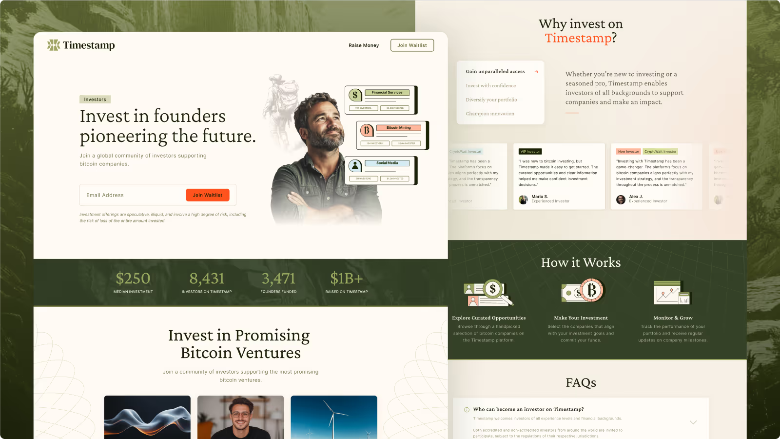
- Webflow website design and build
The Challenge
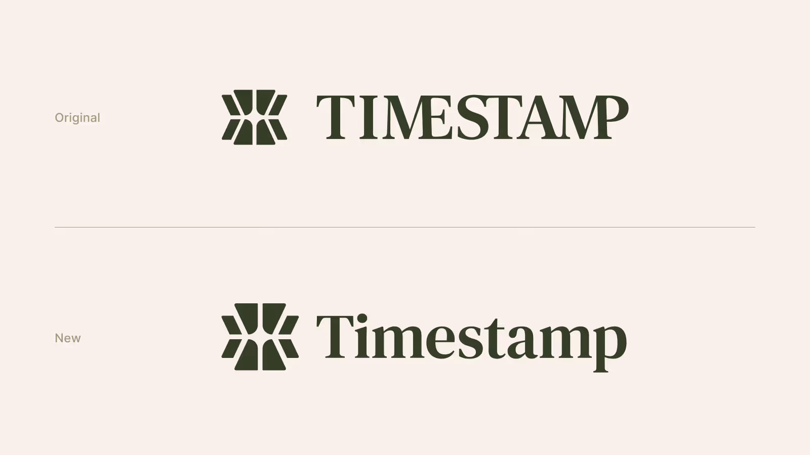
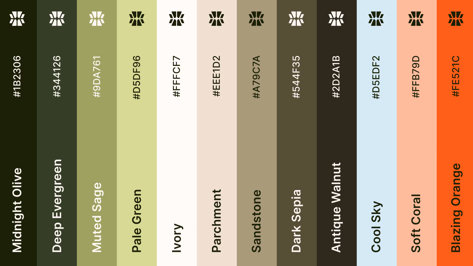
Timestamp’s early-stage brand was missing key components: they had a logo that tried to do too much, a conflicting color palette, and a nearly empty website shell.
They were also tackling a two-sided marketplace problem—needing to appeal to both founders and investors simultaneously without confusing or alienating either group. With no existing users, they needed to project confidence and clarity from day one.
The Challenge
Timestamp’s early-stage brand was missing key components: they had a logo that tried to do too much, a conflicting color palette, and a nearly empty website shell.
They were also tackling a two-sided marketplace problem—needing to appeal to both founders and investors simultaneously without confusing or alienating either group. With no existing users, they needed to project confidence and clarity from day one.