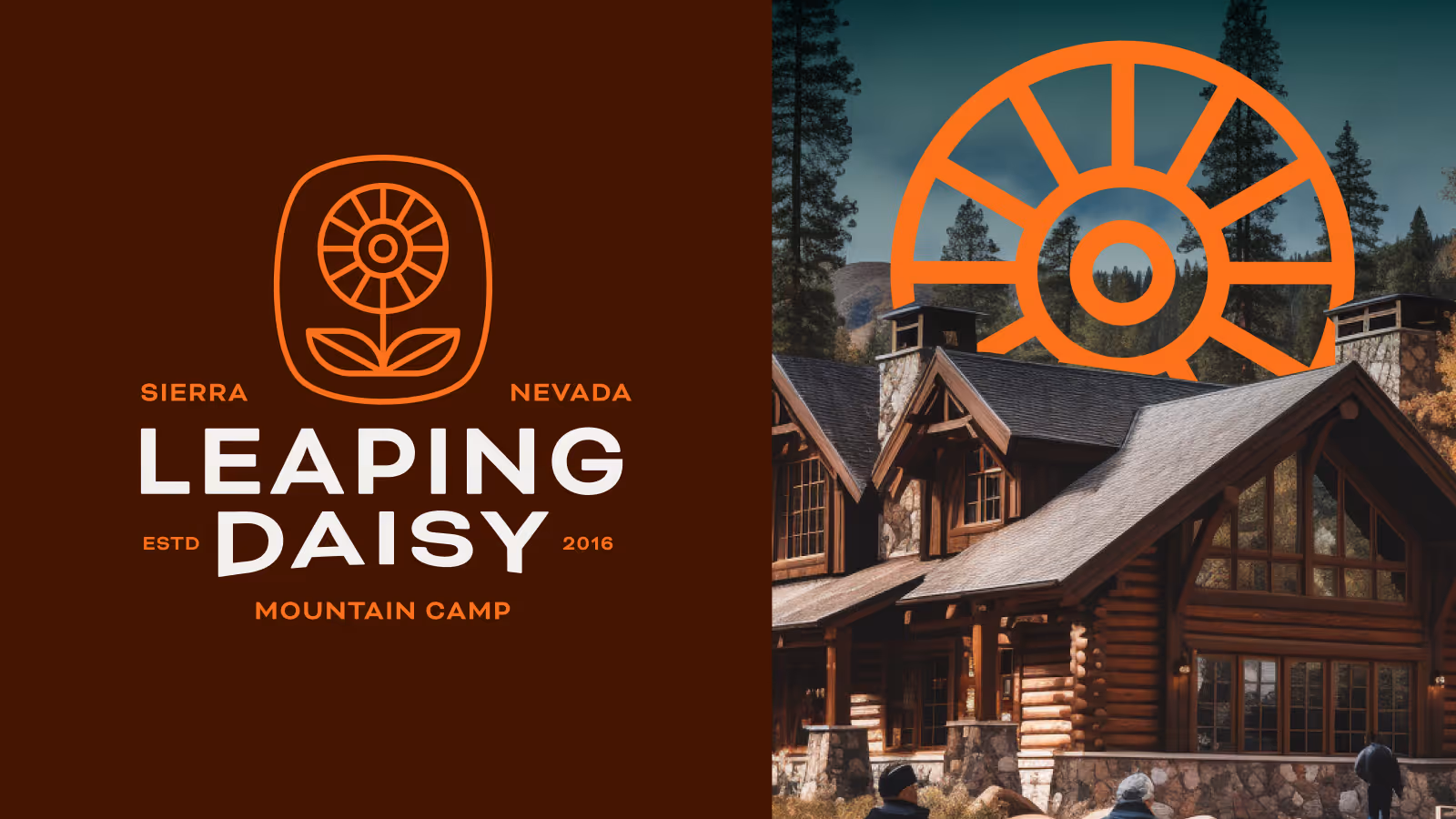
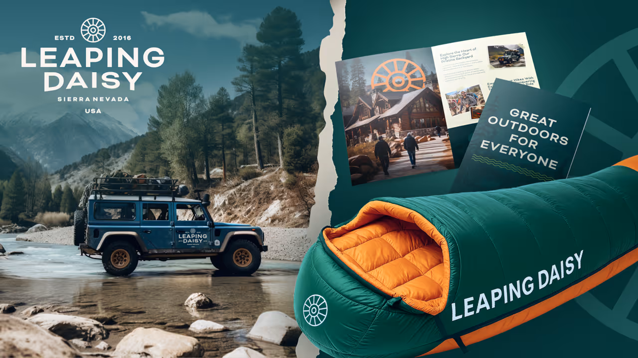
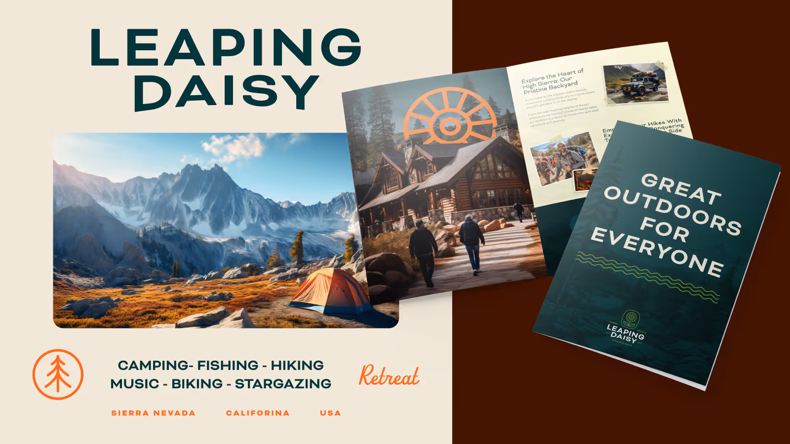
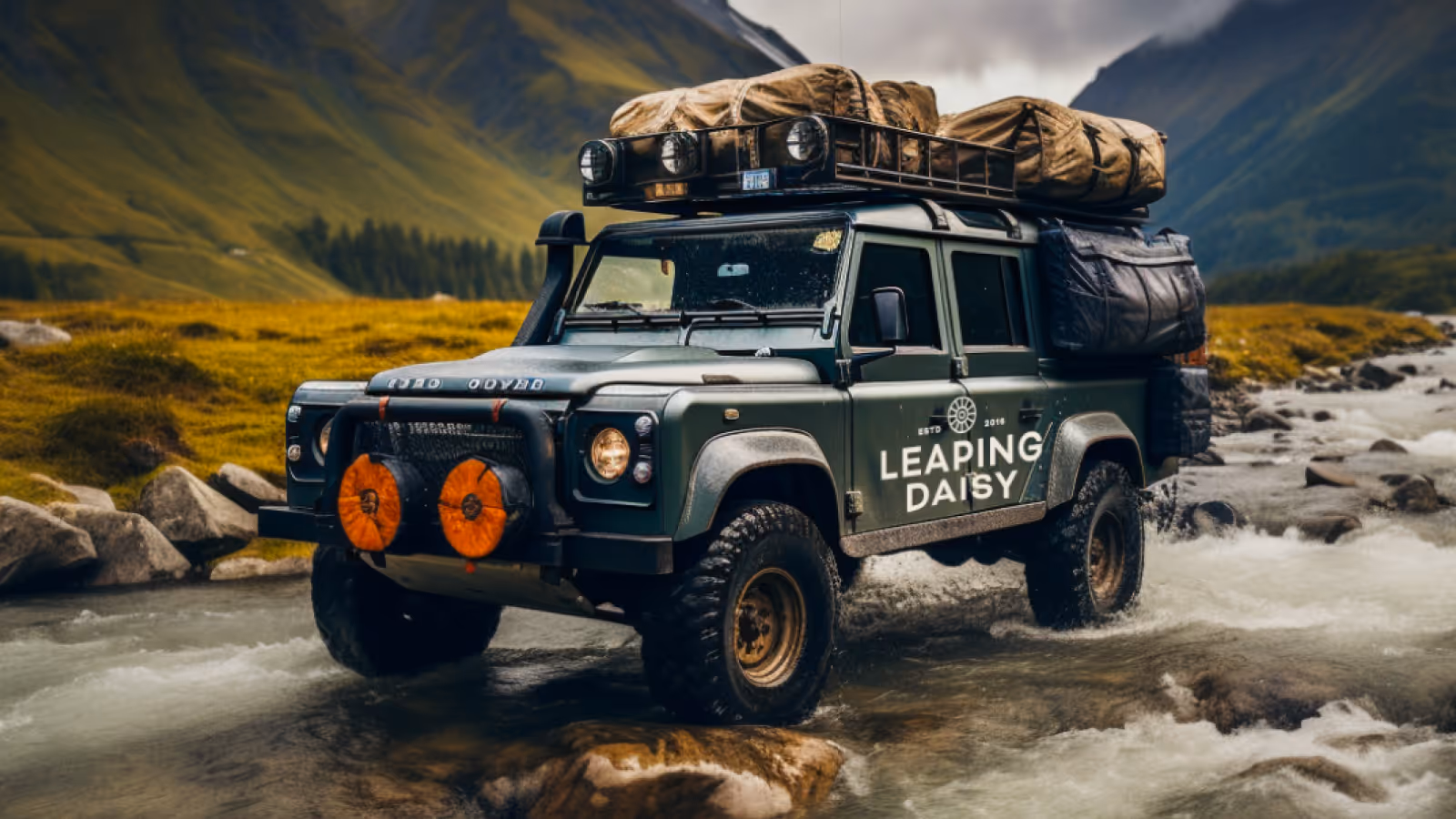
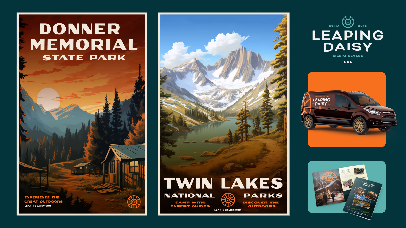
Leaping Daisy
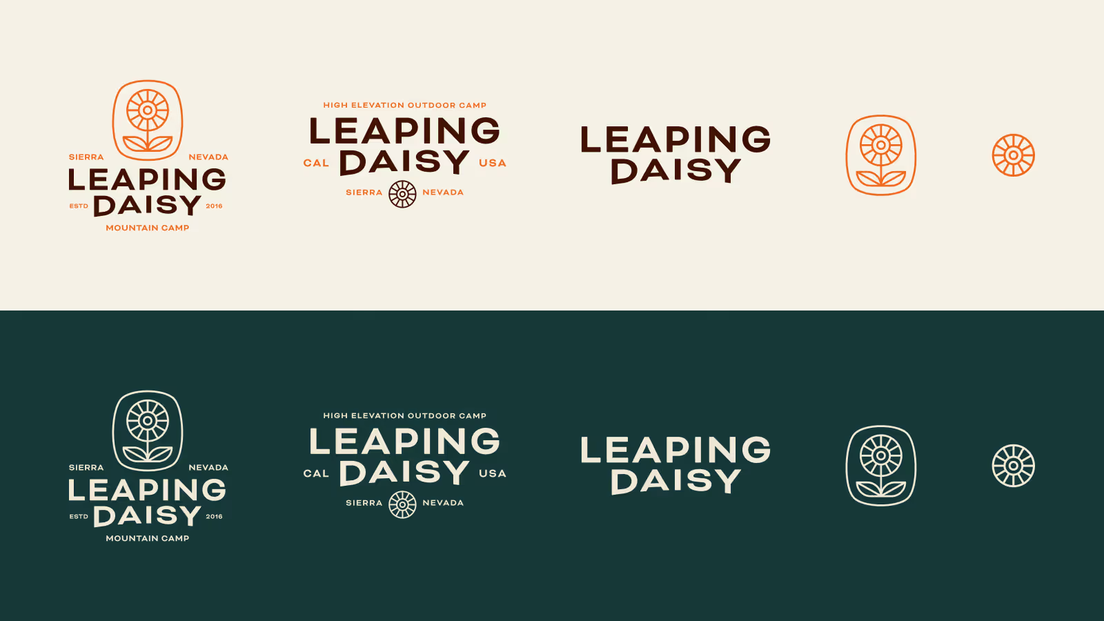
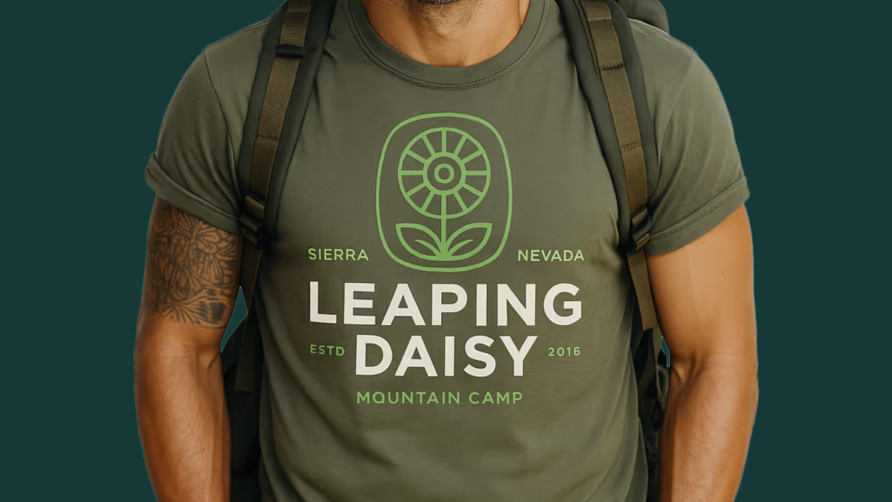
Leaping Daisy came to us with a story. The founder wanted to build an escape from Silicon Valley in the Sierra Nevadas, a camp-style retreat where city tech workers could remember what it felt like to be off the grid. We helped brand the property from positioning through visual identity.
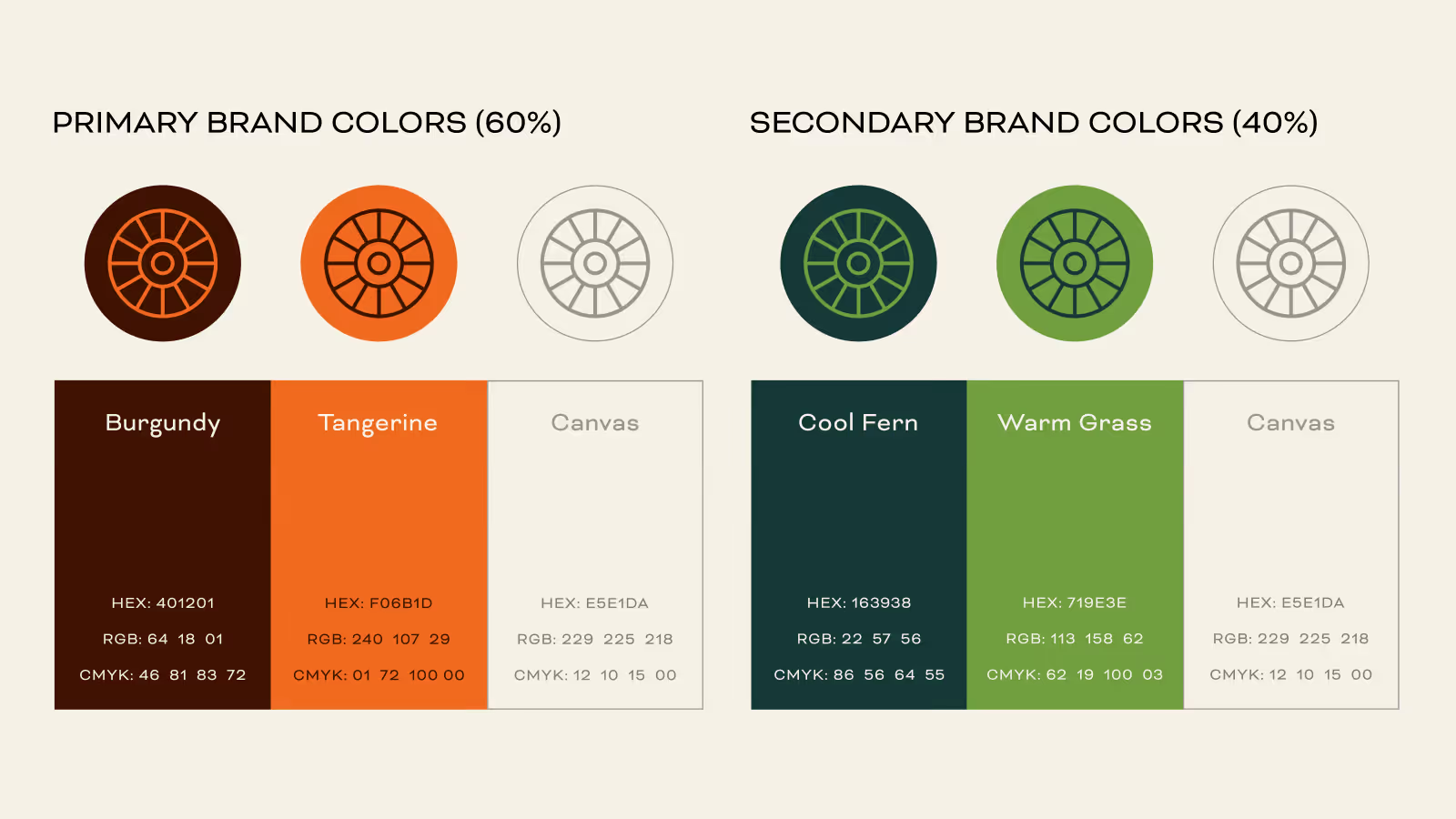
The brand was built to feel rooted in place, calm, and slightly out of step with the modern world in the best way. The property was hit hard by a recent wildfire and is still recovering. The brand work stands as the foundation for what comes next.
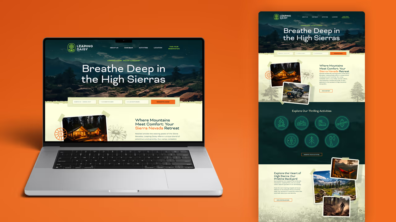
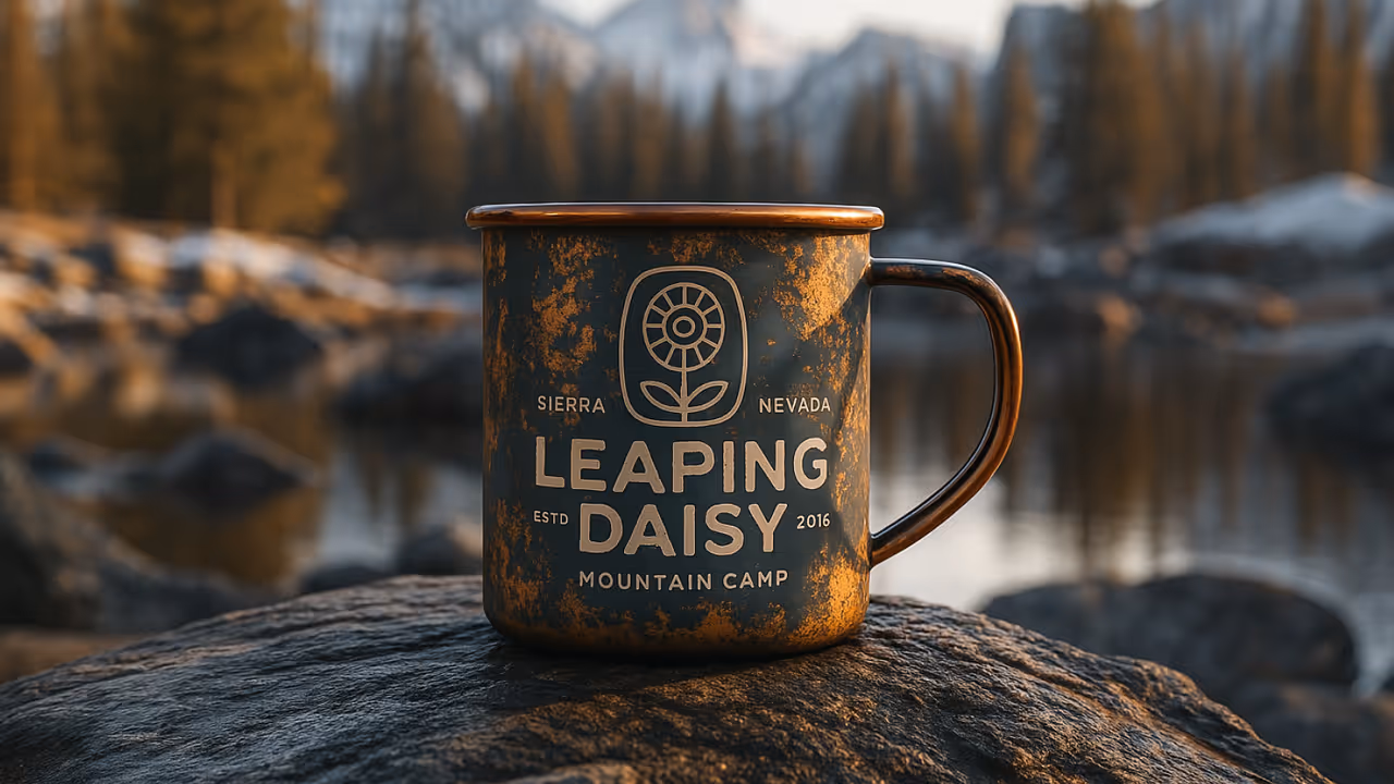
Delivered:
- Full brand identity system
- Brand voice and positioning
- Property and marketing application studies
The Challenge
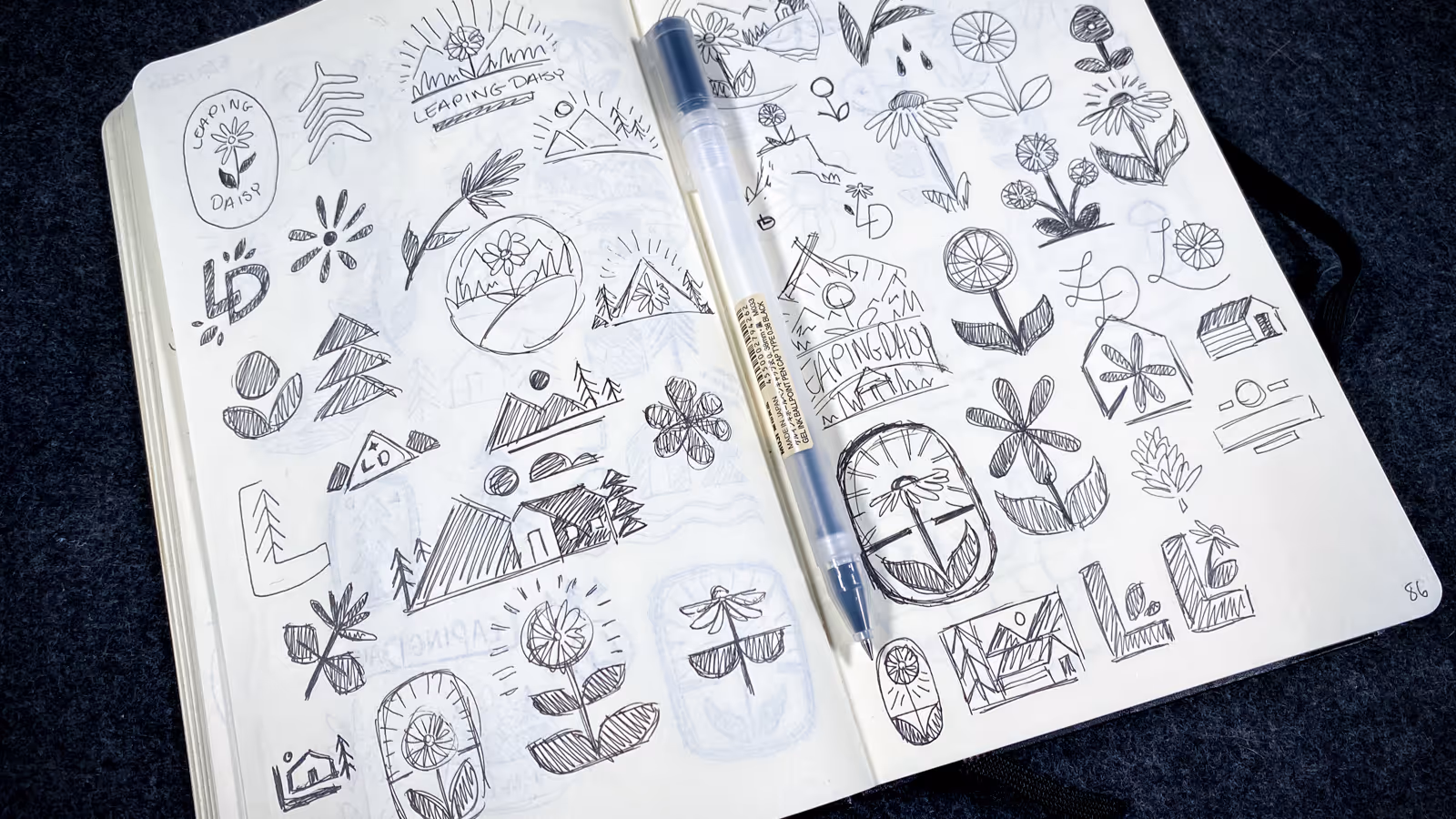
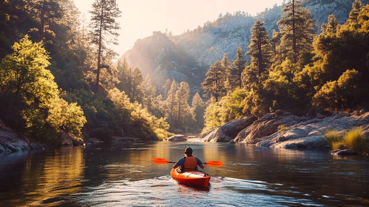
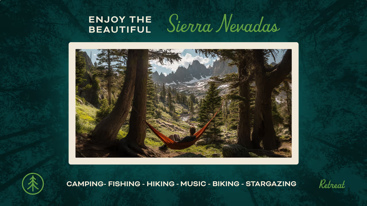
Leaping Daisy wasn’t fully built or developed yet. There were no cabins. No trail signs. No roadmap. Just a beautiful plot of land covered in daisies, a passionate founder, and a growing collection of stories, videos, and memories.
Our challenge was to turn an idea into an identity. To create a brand that captured the wild spirit of the place, while giving shape to a project that was still evolving. It was branding without borders—equal parts strategic vision and creative intuition.
The Challenge
Leaping Daisy wasn’t fully built or developed yet. There were no cabins. No trail signs. No roadmap. Just a beautiful plot of land covered in daisies, a passionate founder, and a growing collection of stories, videos, and memories.
Our challenge was to turn an idea into an identity. To create a brand that captured the wild spirit of the place, while giving shape to a project that was still evolving. It was branding without borders—equal parts strategic vision and creative intuition.