Bird Rock Brewing Co.
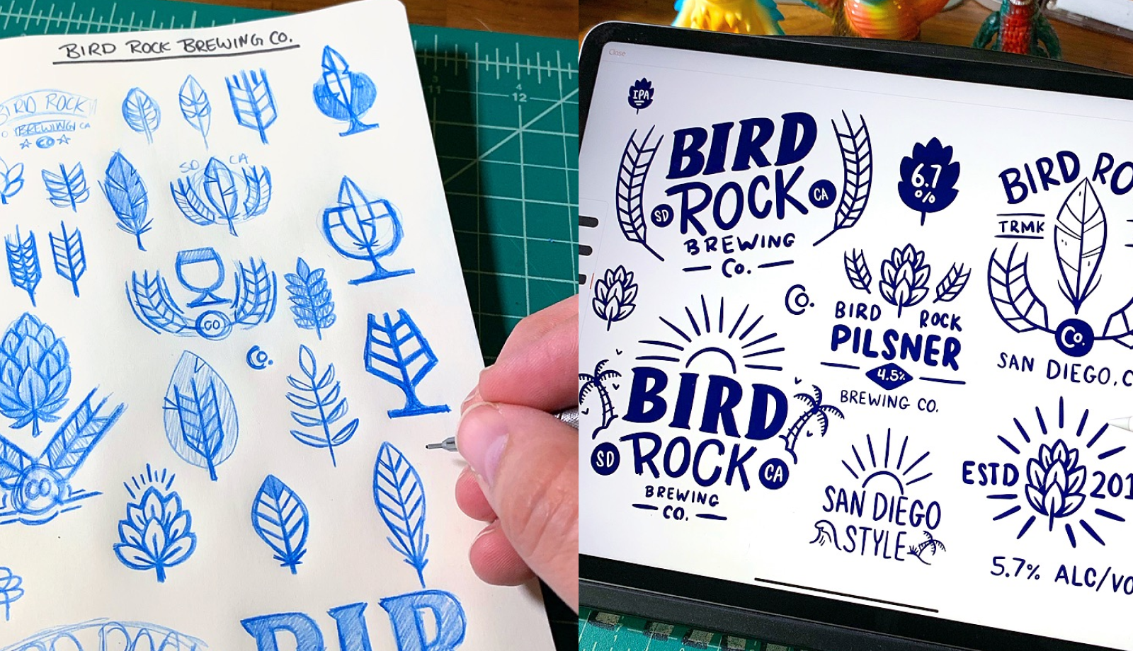
Bird Rock Brewing Co. started in 2019 as a self-initiated project. I'd always wanted to brand a brewery, and at some point waiting for the right client became the wrong move. So I built one. The project let me stretch into craft brewery design and ship something I was proud of without the constraints of a client brief.
The brand became the most-shared work in my portfolio. Since launch, it's driven close to half a million dollars in attributed revenue through the design community, mostly via inbound from people who saw it on Dribbble or in conference talks. It's the work I'm most known for, and the lesson I keep coming back to: sometimes the best client work starts as personal work.
Delivered:
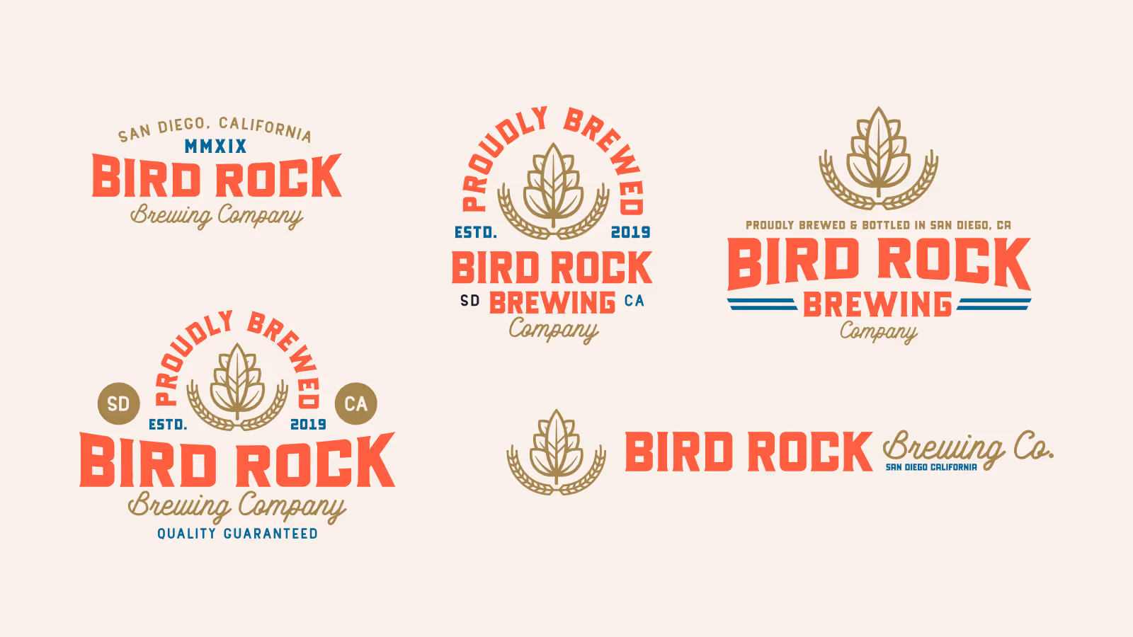
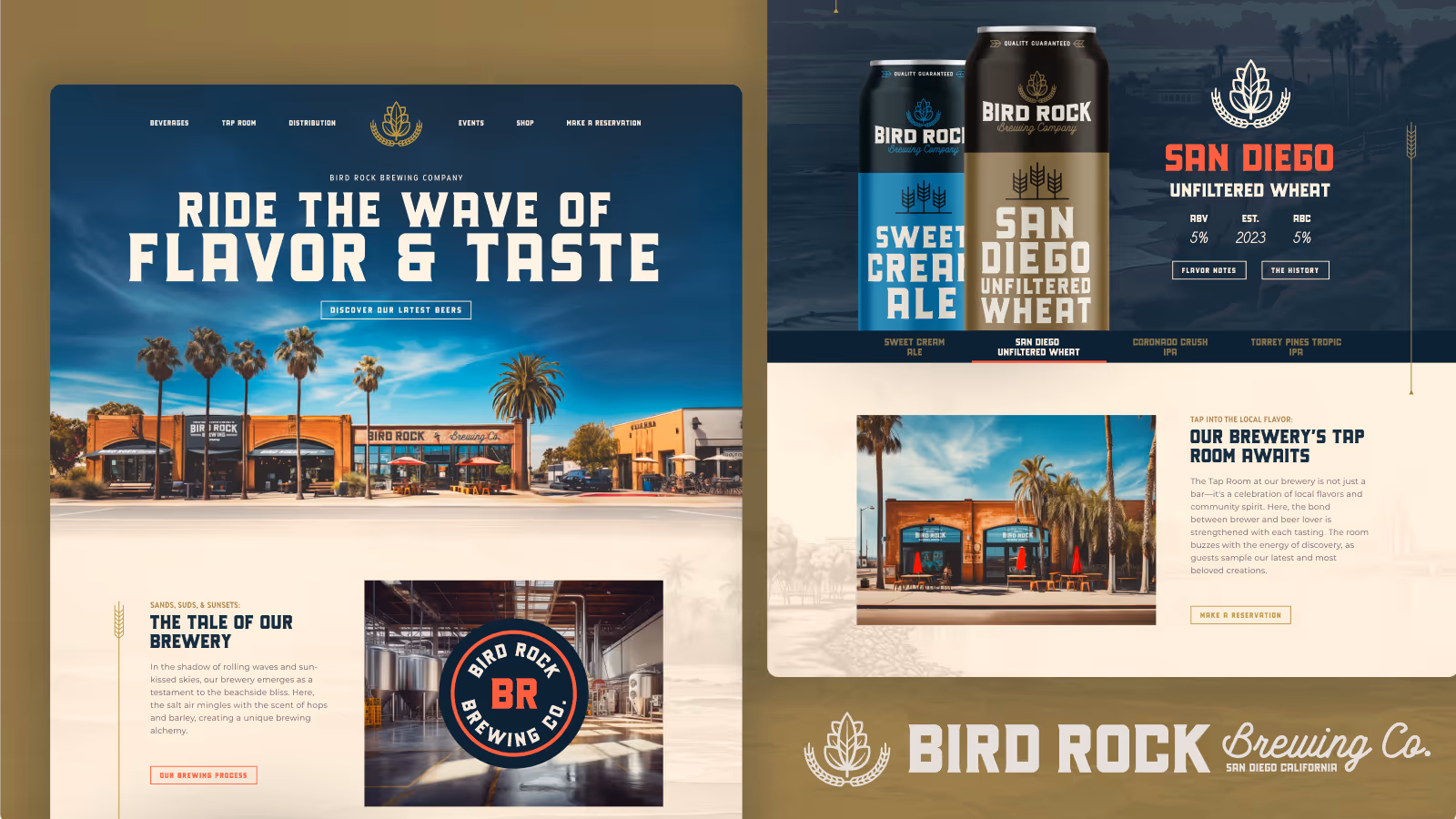
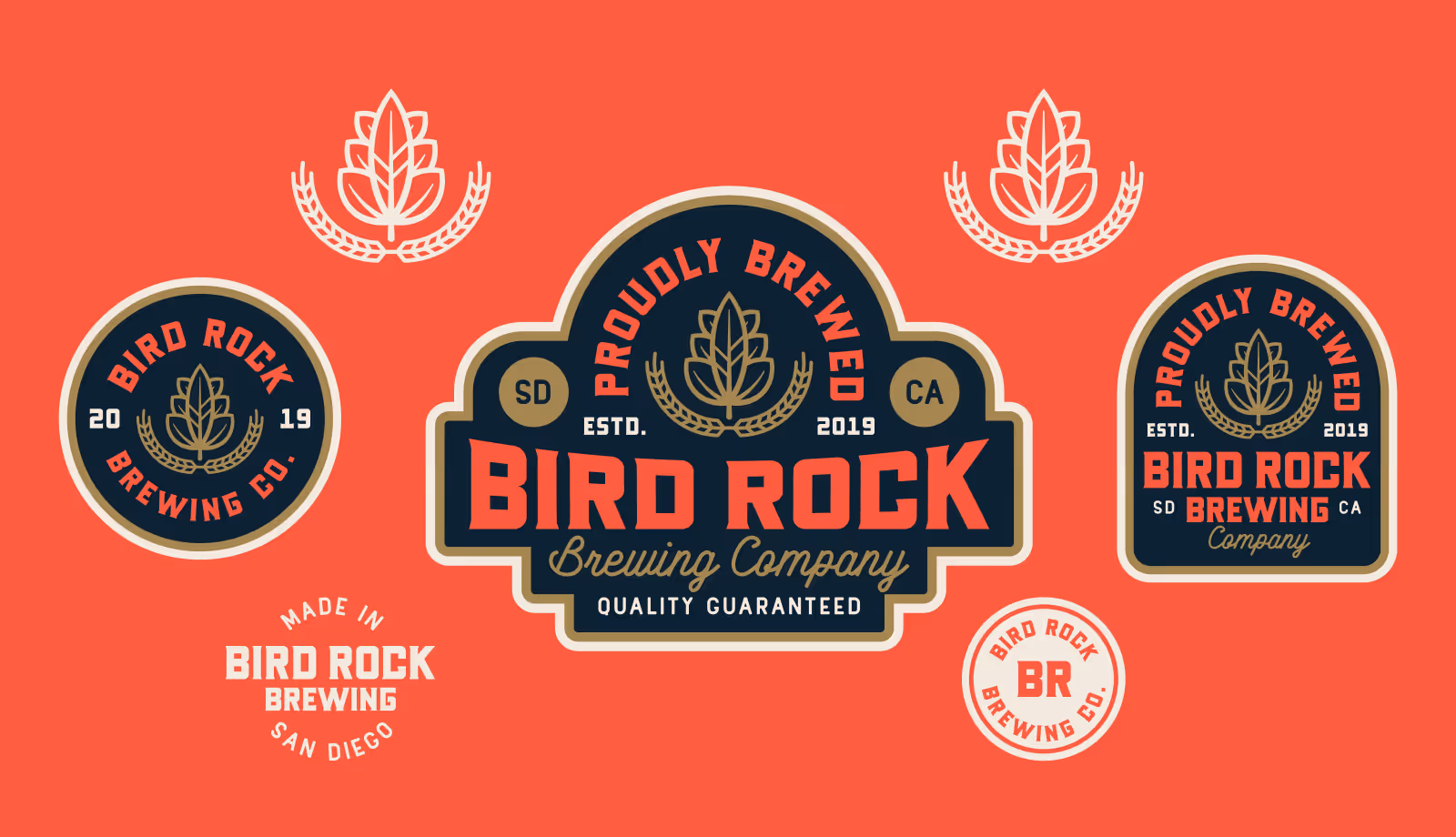
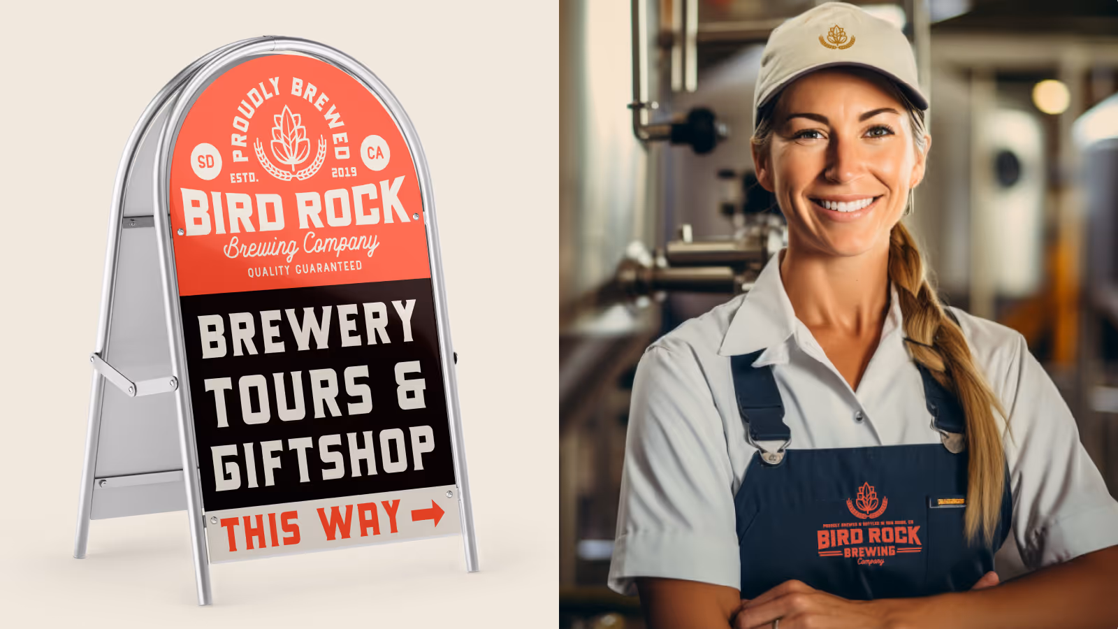
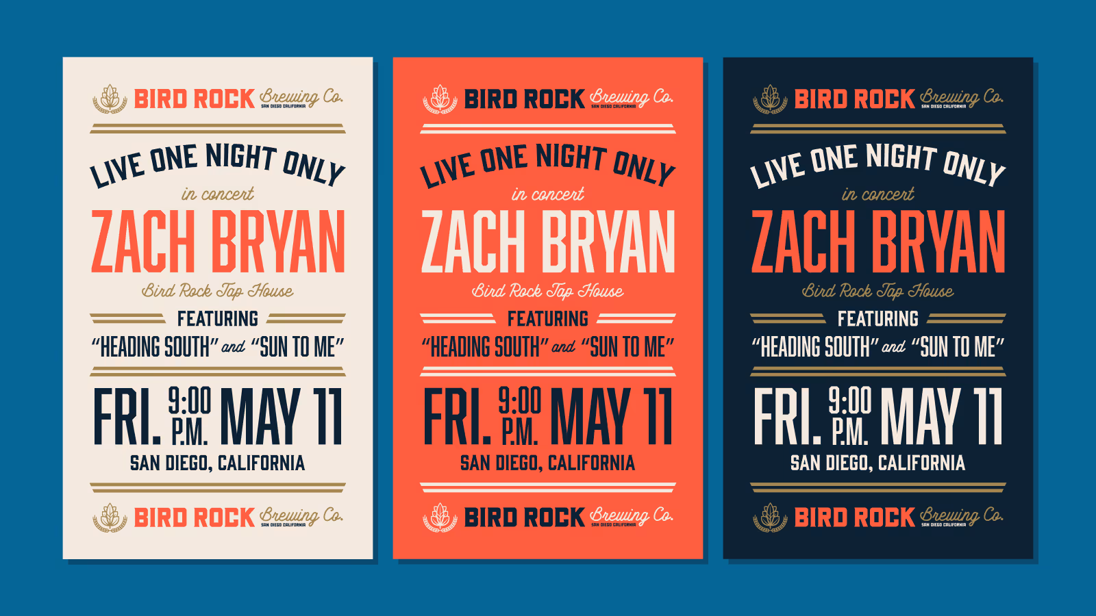
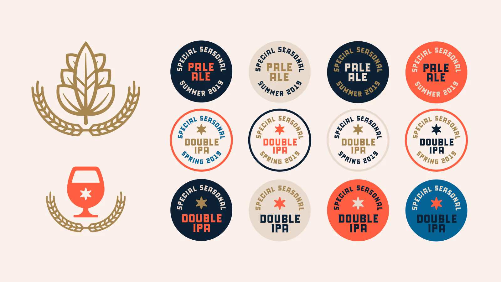
- Full brand identity system (logo, type, color)
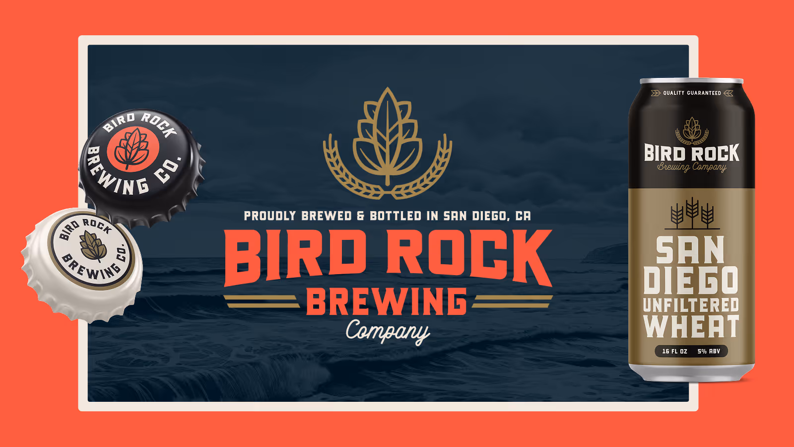
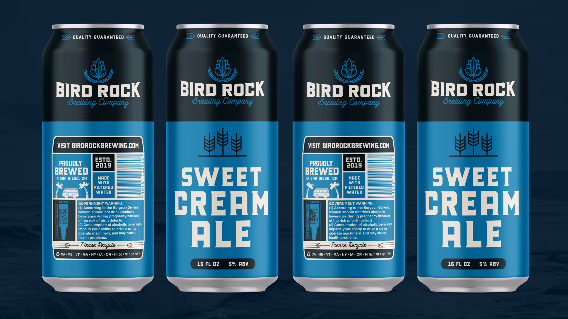
- Packaging and label design
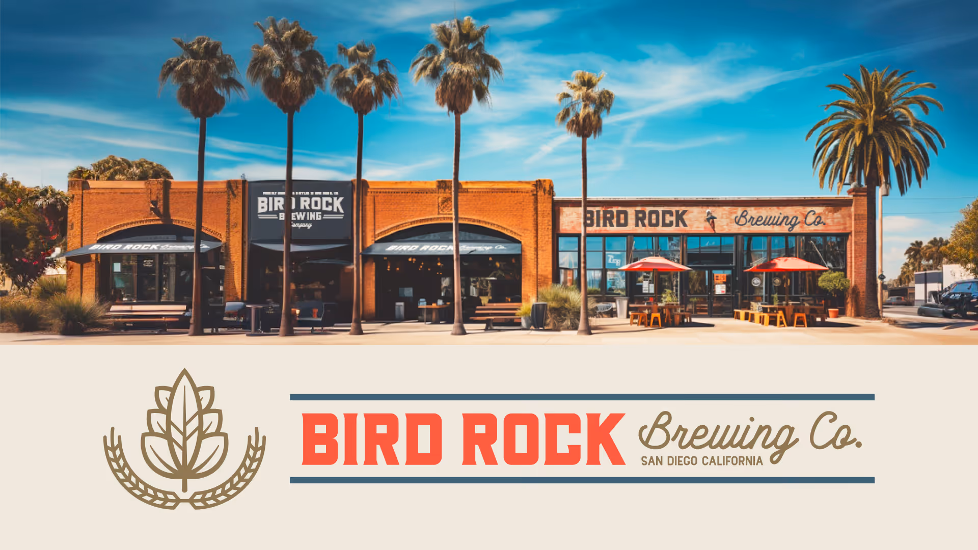
- Brand application studies
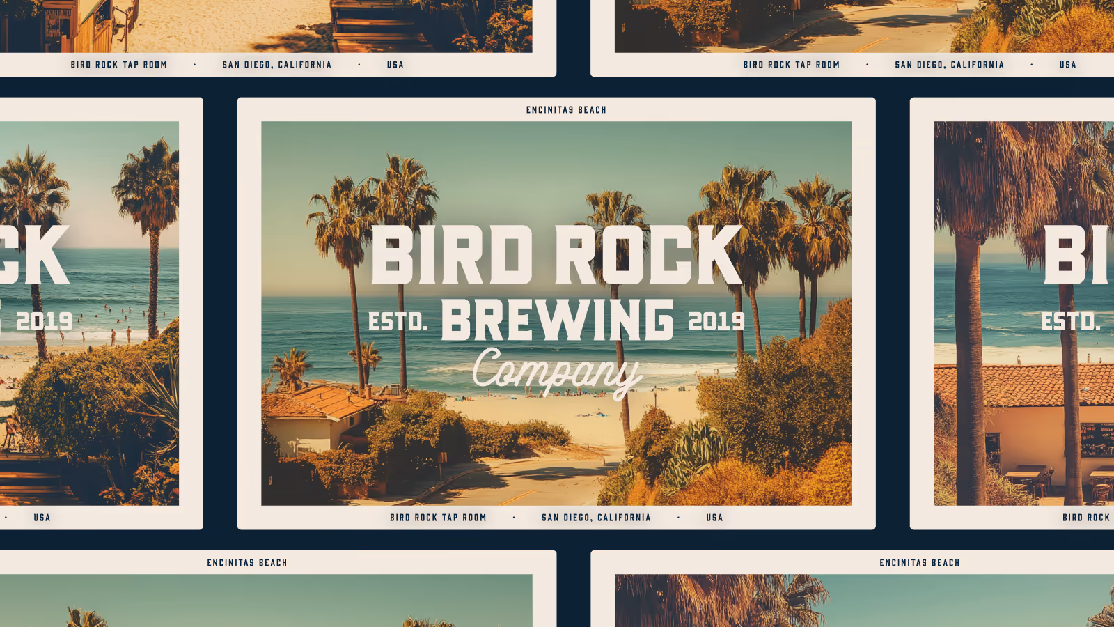
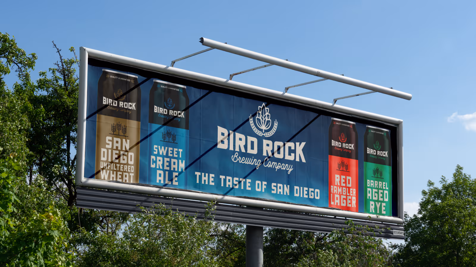
- Marketing collateral system
The Challenge
San Diego is one of the most competitive craft beer markets in the United States—so we imagined Bird Rock as a tiny, local brewery trying to stand out in a saturated space.
For this side project, as the brand evolved, so did the business narrative. In our own narrative, Bird Rock expanded from a garage-style micro-brewery to a larger production facility and eventually opened taprooms across San Diego and Orange County. That growth guided each design phase—from small, scrappy beginnings to more sophisticated, scaled execution.